Tuesday, October 19, 2010

Threadless For Sure!

Splash Page

This is Threadless's website, which I found in the book, Fresher Styles for Web Designers: More Eye Candy from the Underground.  I love this website because they have the coolest shirts and I would love to one day go up to see their store.  The website is very good for a clothing store because they seem to change small details (such as the logo and color scheme) to make it go along with the daily events that go on.  This website is also easy to navigate, even with all the web pages they have on their website.

Inside Page

When you go into the shopping page, they have a lot of shirts in which you can categorize in many ways.  Of course, they changed the banner of this section to reflect the Halloween theme.  It's subtle, but intrigues.  I believe even in this page, like the splash page and the inside page below, it shows off the t-shirts very well.

Inside Page 2

When you go into the page to look at the t-shirts, they give you many user created or pictures taken by Threadless to see what the shirt looks like on different people.  I believe Threadless is a great success because of how viable they are with different designs the users create and vote on the t-shirts, hoodies, etc. they can create.  Also, I must say the logo is very simple but says it all.

Tuesday, October 12, 2010

War of the Worlds... Run and Hide!

Splash Page

This is the website for the 2005 movie of War of the Worlds.  I found this website in the HOW March/April 2006 issue.  I loved this movie (but have yet to see the 1953 version) and I love the website!  What made this very inspirational are the use of the images for the background and the interactivity between everything.  In the splash page, the links on the side are grayed out until you hover over them, where they then turn white (which was one disadvantage for the website).

Inside Page

When you get into the inside pages, it's very cool how they have the selection in the navigation menu highlighted while graying the other options out so that you can still go to them later.  Also, usually putting text on top of images wouldn't work.  I think in this case, it definitely works!  The only disadvantage again is if you browse through some of the pages, the title doesn't show since some of the pictures are very bright.  Then again, that's why they have two ways to give the user a way to see what page they're on.

Friday, October 8, 2010

Packed Full of Fun!

Splash Page

This is David Stark Design's website.  I was browsing through different websites and I happened to find this one.  What made this stand out to me was the overall theme, which is very colorful and friendly.  Not only that, but the navigation is cool, using a hand to point and interact with the rest of the website.  Speaking of interaction on the website, every page has a different theme to interact with the content on the website.


Inside Page

Take these two pages on the website.  The top inside page allows you to punch holes in the different pieces of paper, even the links and content!  The bottom inside page allows the user to grab the pen on the side and write anything they want.  But first, they have to turn the switch to off in order to see any of the content.

Inside Page 2

Overall, this website is very cool!  Especially for a Flash site.  Though I love how much the user can interact with the content, it may almost go too far.  Sometimes, it distracted me from actually looking to see what the content was on the page.

Wednesday, October 6, 2010

Oooohh.. Scary!

Splash Page

This is the ScaryGirl website, which are characters created by Nathan Jurevicius.  I found this website in the Communication Arts March/April 2010 issue.  What makes this page very cool is the background and how it extends the background and makes the Flash content in the middle as the browser gets bigger, which is something in itself.  Especially with the picture they have for the background!  Also, even though they have two navigation systems near each other, it makes it easier for the user to navigate around the site and doesn't really bother me.

Inside Page - About
When you click on one of the links, such as the About Page or Toys, what I like is how the ghosted blue background allows the user to see the picture but still read the content inside.

Inside Page - Game

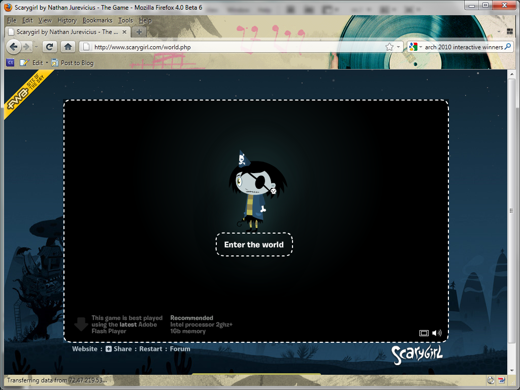
On this page, what I really liked was how the theme changes into a dark background so that when the user finally gets the game loaded up, they can only concentrate on the game at hand and not get distracted by the brightness of the background.  It's also nice on the load page that they are able to give recommendations on the type of processor and a link to download the latest Adobe Flash.

Tuesday, September 28, 2010

Good Stuff.

Splash Page

I found this magazine while browsing through HOW April 2009 issue.  This is an agency called The Design Agency (I know, not a very creative name).  But I really loved the layout because the splash page starts out with a Flash video talking about how creative their work is by using very enticing pictures of desserts and saying they have the right ingredients to make a great design.


Inside Page

It then goes into the inside page, where the links are placed on the sides of the box, each link having their own Flash element (which can be quite annoying if looking at the page for a long period of time).  The right hand side of the website has a small section containing all of the information the user needs, the bottom side having additional information pertaining to the section of the link.  I believe that the website could've been centered vertically and horizontally so the user didn't have to worry about the scroll bars.  Overall, I would say this is a very nice, simple site.

Tuesday, September 21, 2010

So Many Questions, So Many Answers

Home Page

This is the March of Dime's website called "What Are You Wondering?"  I found this website in Communication Arts September/October 2008 issue.  The target audience was for those that had questions or concerns about pregnancy, taking care of a baby, or anything pre-pregnancy and I think that this idea serves the purpose well.  Though at first it may look confusing because you see all of these questions on the screen and the gray baby moving around on the back of the screen.

I think what made it very successful was the search tool, asking the user what they were wondering about.  They would pull down the drop-menu, selecting the topic at hand, and then get the highlighted questions that are throughout the home page.

Inside Page

Afterwards, the user would click on the question, which would lead to a pop-up window with the answer to the question from the March of Dime's official website.  This was definitely a very unique and amazing idea.  The baby in the background isn't too distracting, very affective with highlighting and searching for the questions at hand.  The only item I don't like is how the questions in the pop-up window don't correlate with the theme.  Then again, how can you correlate another window with this sort of theme?

Wednesday, September 15, 2010

Nifty Navigation

Home Page: True North

I found this website in Computer Arts February 2009 issue and it is, once again, all using Flash.  I really like how the homepage is very simple, with a really nice logo (although it's rare to see just a logo for the splash page).  What makes this really interactive is the yellow bar that says "Hello, welcome to the website" and then it goes into the different pages of the website.

Inside Page

Once you get there, you choose the selection and then the drop-down navigation bar goes back up to the top to show off the work.  I believe that it's very simple navigation with very little scrolling on each of the pages of the content and has a very nice color scheme that goes along with it.  The only negative is that for some of the pages, it flashes the background with it as well and on the client's pages, it's hard to scroll through the pictures with the arrows.

Inside Page 2